Gallery wall guide
Vintage Gallery Wall Ideas: How to Mix Art Without It Looking Random
To mix vintage art without it looking random, repeat one color at least three times, vary the subjects, build around one hero print and stick to two frame finishes.
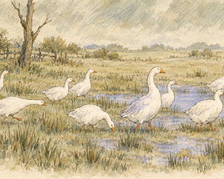
You love a landscape, a moth sketch, a dark floral and a watercolor of geese. Each one is lovely on its own. Hung together, they look like a yard sale.
The problem isn't the art. Collected-over-time walls look effortless because they quietly follow a few rules. Once you know them, you can mix eras, subjects and sizes and still have a wall that looks planned.

Why does a mixed gallery wall look random?
Usually because nothing connects the pieces: every print brings its own colors, every frame is a different finish, and every piece is the same size.
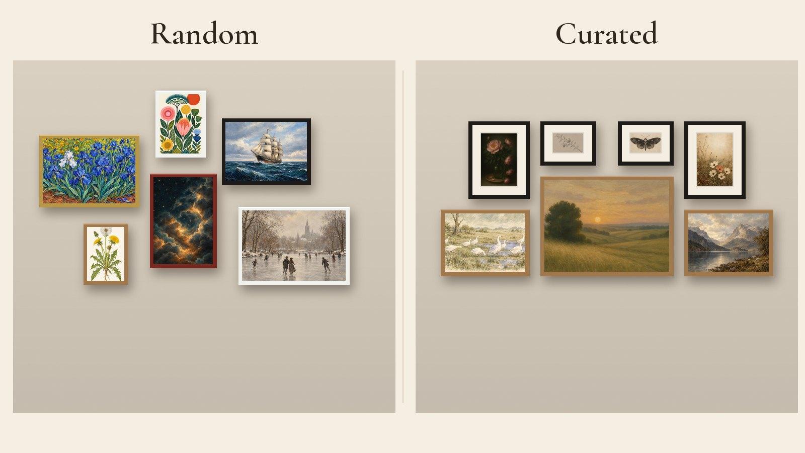
Look at the two walls below. The left one is all good art: irises, a folk-art floral, a tall ship, a dandelion, a starry sky and a skating scene. But it has six palettes, five frame colors and no center, so your eye has nowhere to land. The right one uses the same number of frames and follows four rules.
Rule 1: How do you make different prints feel connected?
Repeat one color at least three times. Pick a thread color and make sure it shows up in most of the prints.
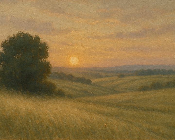
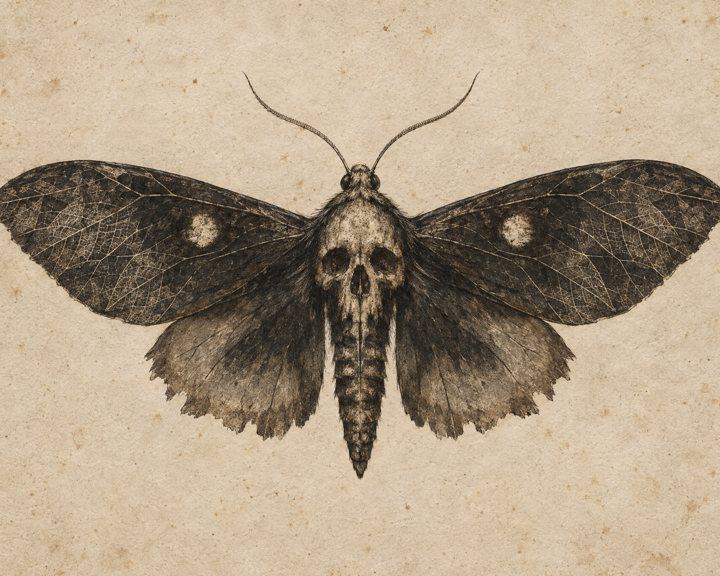
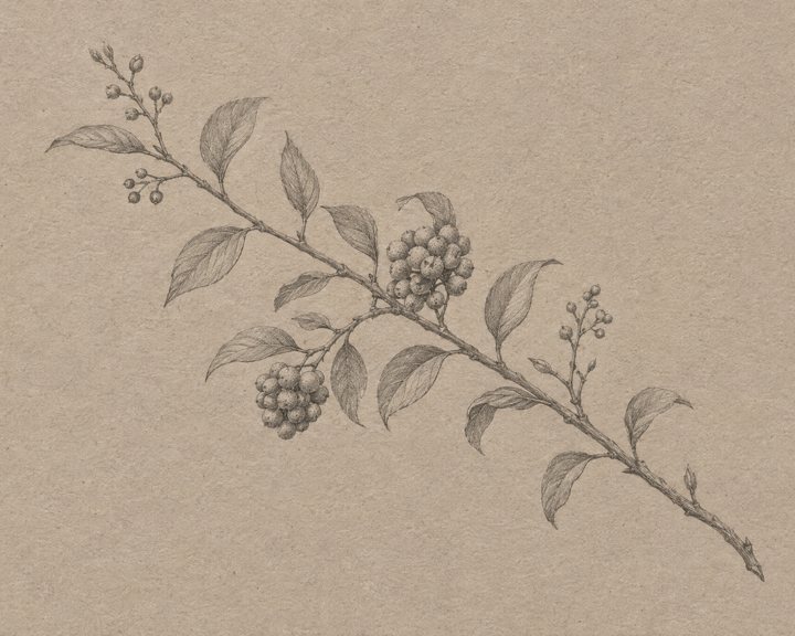
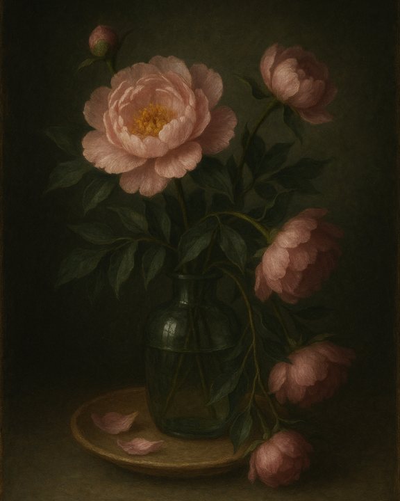
On our wall the thread is warm gold: the sunset sky, the parchment behind the moth, the tan paper of the branch sketch, the faded background of the cosmos. Even the dark peony has a gold dish under the vase. That one color is why a moody still life and a pale watercolor can hang a few inches apart.
Good thread colors for vintage art are the ones old paintings already share: ochre and gold, sage and olive, dusty pink, or ink black on cream. Bright primary blues and reds are the hardest to repeat, which is why the irises and the folk floral fight on the random wall.
Rule 2: Should all the prints be the same subject?
No. Vary the subject and keep the mood. A wall of six landscapes looks like a catalogue; a wall of landscape, flowers, animal and insect looks collected.
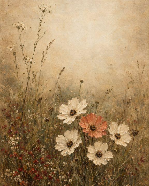
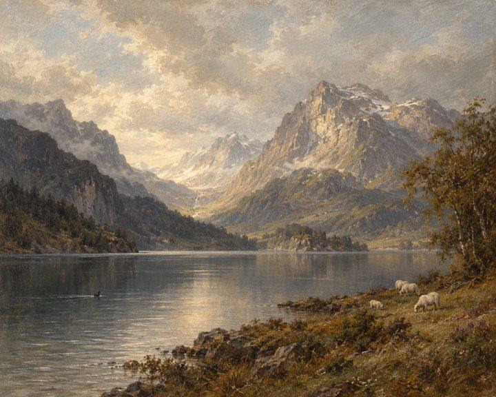
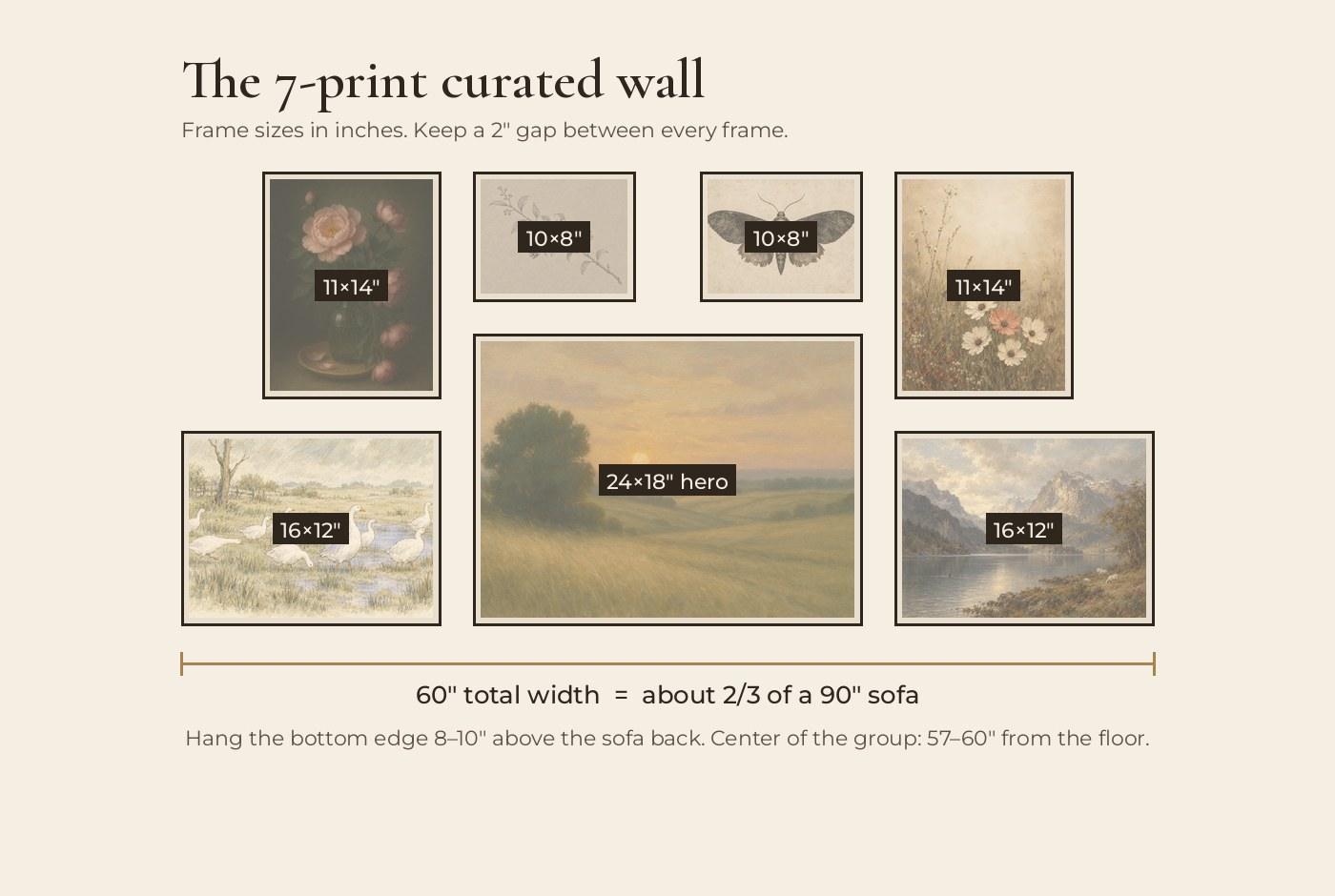
Aim for three or four subjects and spread them out. On our wall: two landscapes, two florals, one animal, one insect and one botanical sketch. Similar subjects never touch: the two florals sit at opposite top corners, and the two smaller landscapes sit at opposite bottom corners.
What should stay the same is the mood: everything here is quiet, a little faded, a little old-world. One cartoonish or neon piece would break it faster than any color clash.
Rule 3: What size should each print be?
One hero, then medium and small. Start with one print about twice the size of the others, and mix portrait and landscape shapes around it.
When every frame is the same size, a mixed wall turns into a grid of competing pictures. A hero gives the eye a place to start. Here it is the 24 × 18" sunset, hung in the center with its bottom edge level with the two outer landscapes. The portrait florals at the top corners and the small sketches above the hero break up the rectangle so it doesn't look like a block.
Choose the hero first. It should be the print with the most of your thread color in it, and usually a landscape, because wide shapes sit naturally above a sofa or bed.
Swipe or scroll sideways to read the full table.
| Role | Frame size | How many | On our wall |
|---|---|---|---|
| Hero | 24 × 18" (61 × 46 cm) or 20 × 16" | 1 | Rolling Hills Sunset |
| Medium | 16 × 12" or 11 × 14" | 2–4 | Geese, Highlands Lake, Peony, Cosmos |
| Small | 10 × 8" or 8 × 10" | 2–4 | Branch sketch, Moth |
Rule 4: Do the frames need to match?
No, but keep to two finishes and give each finish a job.
On our wall, the dark and delicate pieces (the peony, the cosmos and the two sketches) are in slim black frames with wide cream mats. The three landscapes are in warm oak with no mat, which keeps them looking like paintings. Two finishes look deliberate. Three or four look like whatever was in the cupboard.
Swipe or scroll sideways to read the full table.
| Finish | Best for | Mat? |
|---|---|---|
| Slim matte black | Sketches, botanicals, dark florals | Yes, warm cream, 2–3" wide |
| Warm oak or honey wood | Landscapes, farm animals, watercolors | Optional |
| Antique gold | Oil paintings and portraits in a formal room | Thin or none |
| Dark walnut | Moody landscapes, seascapes | Optional |
Balance light and dark: put your darkest piece in one corner and something with weight in the opposite corner. Here the dark peony (top left) is balanced by the Highlands lake (bottom right), so the wall doesn't tip to one side.
How big should a gallery wall be, and how high do you hang it?
About two thirds the width of the furniture below, with the center 57–60" from the floor.
Our 7-print wall is 60" wide and 28" tall, which suits a 90" sofa. Copy the frame sizes below, or scale every frame down by the same amount for a smaller sofa or a bed. For other furniture widths, see our art size chart for sofas, beds and consoles.
Swipe or scroll sideways to read the full table.
| Measurement | Inches | Centimetres |
|---|---|---|
| Gap between frames | 2" | 5 cm |
| Width of the whole group | 2/3–3/4 of the furniture | 2/3–3/4 of the furniture |
| Bottom edge above a sofa back | 8–10" | 20–25 cm |
| Bottom edge above a headboard | 6–10" | 15–25 cm |
| Center of the group on a bare wall | 57–60" from the floor | 145–152 cm |
How to hang it without extra holes
- Trace every frame on kraft paper and cut the shapes out. Mark where the hanging hook sits on each one.
- Tape the hero up first, centered on the sofa, then add the rest with painter's tape, keeping 2" gaps (a 2" scrap of cardboard makes a good spacer).
- Live with the paper for a day. Swap two shapes if one side feels heavy.
- Nail through the hook marks, tear the paper away, and hang the frames.
What are the most common gallery wall mistakes?
- Hanging too high. A group that floats near the ceiling feels disconnected from the room. Keep the bottom edge 8–10" above the sofa.
- Uneven gaps. 1" here and 4" there is the fastest way to look random. Measure every gap.
- All the same size. Without a hero, mixed art reads as clutter.
- Too many bright colors. One saturated piece is an accent; three are a fight.
- Too small for the wall. A cluster of 5 × 7s above a big sofa looks lost. Go bigger or add pieces until the group reaches two thirds of the sofa width.
Can I use these rules for seasonal walls?
Yes. Keep the frames and swap the prints.
Because these are digital prints in standard frame sizes, the same seven frames can carry a cozy fall wall now, a moody Halloween gallery wall for October, old-world Christmas art in December and a winter cottage wall after the tree comes down. The four rules stay the same: pick a thread color for the season (rust in fall, deep green and gold at Christmas), vary the subjects and keep the hero in the middle.
FAQ
How many prints do I need for a gallery wall?
Five to nine is the easiest range. Fewer than five reads as a few separate pictures; more than nine needs a bigger wall and more planning. Odd numbers are easier to balance.
Can I mix oil paintings with ink sketches?
Yes. Put the sketches in mats so they hold their own next to the paintings, and make sure at least one color from the paintings shows up in the sketch paper or ink.
Do all my frames need to match?
No. Two finishes is the sweet spot, for example black for small botanicals and warm oak for landscapes. Three or more finishes is where a wall starts to look random.
How far apart should gallery wall frames be?
Keep every gap the same, about 2 inches (5 cm). Even spacing is what makes different-sized frames read as one piece.
Will I get a physical print?
No. Calvin Art House prints are high-resolution digital files you print at home or at a local print shop, in five ratios that fit standard US frames. Nothing ships.
More styling guides
Start with your hero
Pick one landscape you love, then build the wall around its colors.
Shop vintage landscapes Shop botanical prints