Botanical styling
How to Choose Vintage Botanical Prints That Work as a Set
Start with one botanical print you love, then compare its companions by background tone, drawing style and the amount of space around the plant. Matching frames can unify a pair or trio, but they cannot make every combination feel balanced.
Two prints can both show green leaves and still look unrelated on the wall. One may be a fine stem on pale paper; the other, a dense painting with a dark background. Neither is the wrong choice. They simply ask for different ways of being grouped.
This guide helps you select the images inside a botanical set before buying extra frames. For room-specific ideas, see our botanical kitchen and bathroom guide.
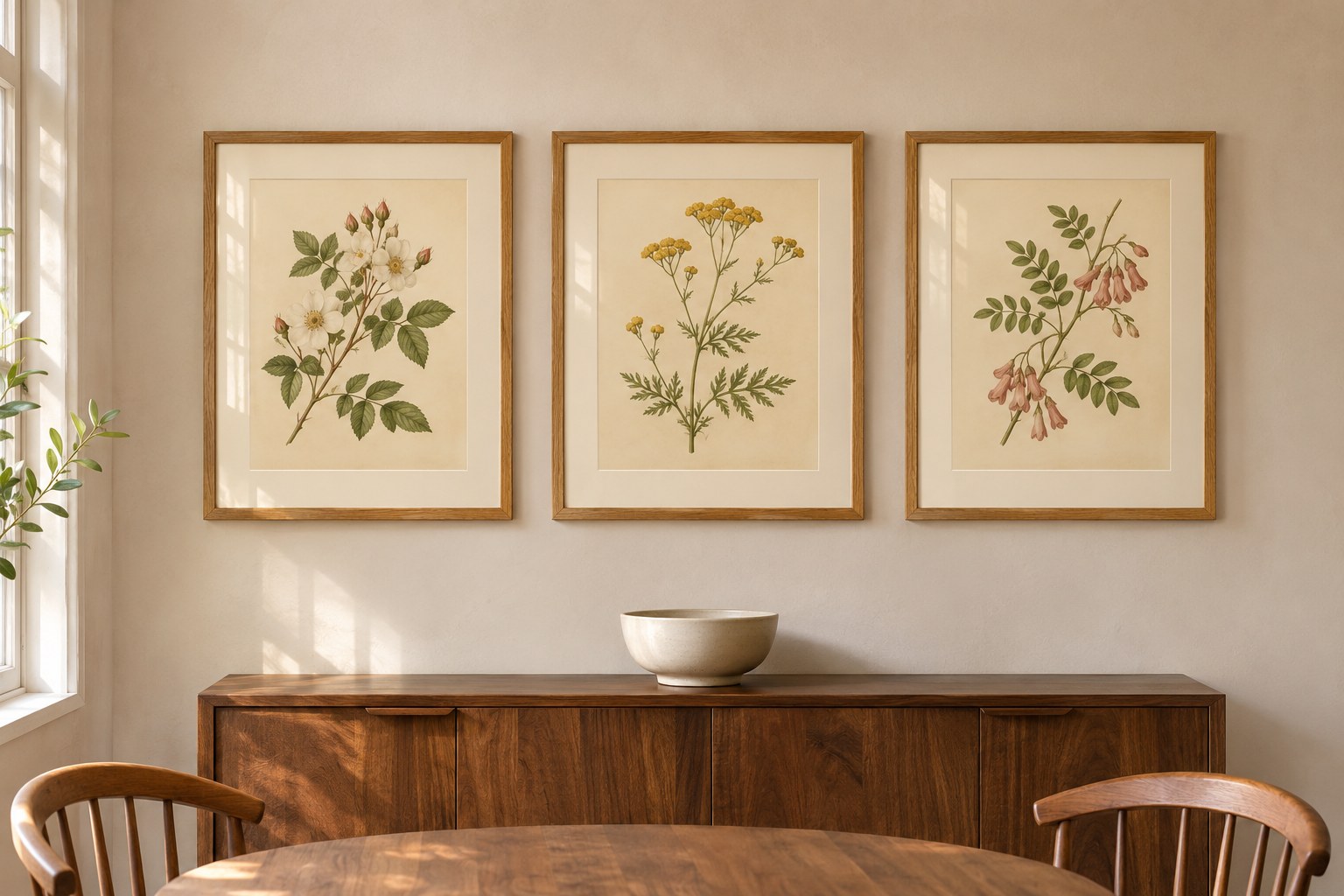
Choose the kind of botanical collection you want
Decide whether you want a quiet sequence or a collected mix. A quiet sequence might use three airy plant studies with similar margins. A collected mix might place a botanical study beside a floral painting and a personal photograph. Both can work; the second needs a clear anchor rather than an expectation that every image will match.
For your first pair, choose two images with similar backgrounds and illustration styles, then vary the plant. For a more varied gallery, keep your favorite image and choose which feature you will repeat: a cream mat, a dark outline or one flower color. Our guide to building around existing art covers that broader approach.
A note on “vintage”: a newly printed image with a vintage appearance is not an antique sheet. If the age, artist or original publication matters to you, look for documented information from the seller or archive. A yellow background alone does not establish provenance.
Compare the paper before the flowers
Place candidate images beside each other on the same screen, without their decorative room mockups. Compare the areas around the plants first. Do they look cream, grey-white, pinkish or strongly yellow? A background difference that disappears in separate listing photos can become the most noticeable feature in a row.
You do not need perfectly identical paper tones. The useful question is whether you enjoy the contrast. If you want a calm set, begin with backgrounds that look closely related. If one print has a heavily aged border, decide whether that border is a feature you want to repeat or an accent you want to keep separate.
Screen previews are a starting point. Before ordering a whole set at its final size, compare small proof prints made with the intended printing process and paper. Look at them together in the room by day and with your usual evening lighting. Use the seller’s permitted preview or purchased files; do not remove watermarks to make a test.
A matching outer mat can repeat one color around different prints, but the original backgrounds remain visible inside the openings. Check both borders together before choosing a bright white mat by default.
Match the scale of the plants, not just the sheet size
Equal-size files do not necessarily make equal-looking pictures. A fine branch occupying half a page can feel much quieter than a broad flower head filling nearly the whole sheet. Compare the plant’s height, width and density inside the proposed visible opening.
- Show each candidate in its intended frame shape at the same relative scale.
- Notice how much blank paper remains above, below and beside each plant.
- Compare the darkest or densest parts of the images. Does one keep pulling your attention?
- Choose whether that difference makes a pleasing anchor or breaks the calm sequence you wanted.
Do not enlarge an image until its stems, roots or printed labels are cut off just to make the subjects equal. Keep the whole composition where those details matter. A different companion is often a better solution than a forced crop.
Three ways to build a botanical set
Swipe or scroll sideways to read the full comparison.
| Approach | Keep consistent | Let this vary | Watch for |
|---|---|---|---|
| Quiet pair | Background, drawing style and outside frame size | Plant silhouette: an upright stem beside a softer branch | One plant appearing much smaller inside its mat |
| Study-style trio | Similar margins, line weight and frame finish | Leaf shapes and restrained flower accents | A dense middle image overpowering two delicate companions |
| Collected botanical group | One repeated mat or frame finish and a clear anchor | Image size, botanical subject and medium | Every picture competing to be the focal point |
These are starting arrangements, not rules about which plants belong together. A favorite rose and a fern may be a more satisfying pair for you than three matching specimens chosen only because they came in one bundle.
A worked example: a pair or trio above a sideboard
Suppose you have a 54-inch-wide wall section above a sideboard and are comparing frames with an outside width of 14 inches. With a chosen trial gap of 2 inches, a pair occupies 30 inches: 14 + 2 + 14. A trio occupies 46 inches: 14 + 2 + 14 + 2 + 14.
Centered within that hypothetical wall section, the pair leaves 12 inches at each end; the trio leaves 4 inches. The arithmetic shows fit, not which arrangement will look best. These dimensions are an example, not a recommended gap or clearance for every room.
Now compare the images. Three airy stems might make the wider arrangement feel calm. Three full, dark floral paintings could feel much more dominant in the same footprint. If you prefer the pair, leave it as a pair rather than adding a weaker third print to use the wall.
Measure finished frames, including mats and moulding, rather than using the advertised print dimensions. Sketch their complete outlines and compare the group from the dining chair as well as the doorway. Keep switches, doors and everyday functions accessible. For more layout options, see our gallery-wall layouts.
Choose frames after comparing the prints
Lay a frame or finish sample beside the actual images. Slim timber can repeat wood already in the room; a dark frame can echo fine outlines in the art. Compare the result rather than assuming botanical prints always need one finish.
If the images already differ in color and density, repeated frames and mats give you fewer additional variables to manage. If the images form a closely matched study set, varied frames may be a deliberate way to make it feel more collected. Try one change at a time so you can see what improves the relationship.
Check the visible opening before you order. A listing’s print size, a frame’s nominal size and its outside dimensions describe different things. Confirm which dimensions the seller is giving you, particularly when labels or a decorative border sit near the edge.
A selection worksheet to use before you buy
Copy these prompts for your two or three shortlisted images. Use the notes to decide what needs changing, rather than treating the sheet as a score you must maximize.
- My anchor print
- The image I want to keep, and why: ______
- Desired effect
- Quiet sequence / one focal image with companions / collected mix: ______
- Backgrounds
- Anchor paper tone: ______ Companion tones: ______
- Plant scale and density
- Airy or full? Similar visible height? Any crop or label at risk? ______
- Shared feature
- The color, drawing style, mat or frame finish I will repeat: ______
- Finished footprint
- Outside frame widths + all gaps: ______ Available section: ______
- Proof check
- What changed when I compared the prints in daylight and evening light? ______
- Final decision
- Keep the pair / add a strong third / choose another companion / display separately: ______
Before ordering vintage botanical prints
- Confirm whether you are buying digital files, a physical print or a framed item.
- Check the included file shapes and sizes against the composition you want to preserve.
- Review how much border is part of the image and how much will come from the mat.
- Check provenance and usage terms if historic origin or reproduction rights matter to your choice.
- Choose the set because you enjoy the images together, not because the bundle contains more prints.
For file preparation and print settings, use our digital wall-art printing guide. To compare available artwork, browse the vintage botanical collection. The room example above demonstrates a styling relationship; check each product listing for its actual artwork and included files.
Common questions
Do botanical prints need to come from the same series?
No. Compare their backgrounds, illustration styles and plant scale. A shared series is one way to get consistency, but it is not the only way to make a pair you enjoy.
Can I mix botanical drawings and flower paintings?
Yes. For a collected group, choose one as the anchor and repeat a frame finish, mat or color in the companions. For a very quiet row, closely related styles may be an easier starting point.
Should I choose two prints or three?
Compare the complete frame footprint and the strength of each image. A pair is finished when it works for your wall; a third image should improve the group rather than simply fill space.