Hallway styling
Narrow Hallway Wall Art: Choose the Layout for the View You Actually Have
Choose hallway art from three positions: entering, passing beside it and approaching from the other end. Test the complete frame footprint before filling a long wall, and keep doors and everyday movement working normally.
A hallway can have plenty of empty wall and very little room to stand back. Plan for that difference.
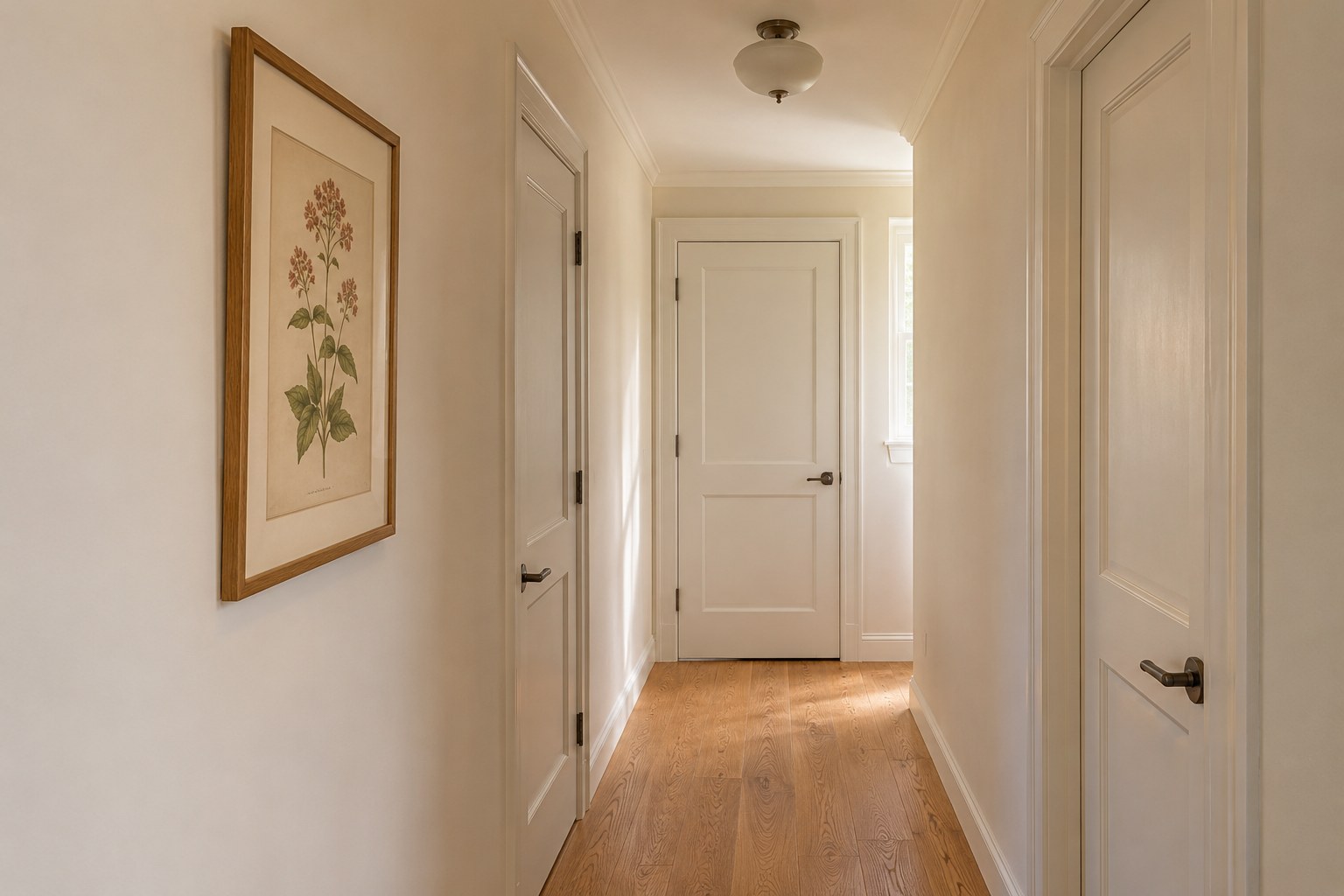
Start with the view, not the empty wall
The most useful question is where you will actually see the picture from.
Stand at each entrance and notice which wall faces you. Then walk along the hall. A picture that looks balanced in a straight-on mockup may be visible mainly at an angle in daily life. A detailed botanical, drawing or small photograph can be enjoyable close up; a landscape whose appeal is its whole composition deserves a view from which you can take it in.
These are preferences to test, not categories of art that are forbidden in a narrow space. Large art can work. The decision is whether you enjoy the image at the distance and angle your particular hall offers.
- Entering: what catches your eye first, including doors and the room beyond?
- Passing: can you comfortably pause to look, and do you like the close view?
- Returning: does the arrangement still feel intentional from the opposite direction?
Photograph each view with the same ordinary camera setting. Avoid choosing a layout solely from a very wide-angle property-style photograph that makes the passage appear more generous.
Choose between three useful layouts
Swipe or scroll sideways to read the full table.
| Layout | Worth testing when… | Check before committing |
|---|---|---|
| One picture on a side wall | You want a calm starting point, or doors leave one clear section. | The actual image still appeals at an angle and close up. |
| A short row within one wall section | You enjoy a sequence of smaller subjects as you pass. | Outside frame sizes plus gaps fit without crowding door trim or controls. |
| One end-wall anchor | A blank wall faces the main approach. | It is actually a wall, rather than a door, access panel or route that needs to stay usable. |
Choose one starting arrangement. You do not need to decorate both sides or combine all three. If the hall already opens onto a striking picture in another room, that borrowed view may supply the focal point.
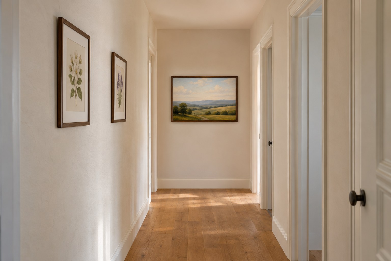
Map doors before spacing frames
Treat each uninterrupted stretch of wall as a separate candidate area.
Sketch door trim, switches, thermostats, cupboards and other features that must remain accessible. Check doors in their normal open positions, including handles. Do not use the entire wall length as the available picture width if a doorway interrupts it.
For a repeated row, measure the outside of each frame. A print size is not the finished frame size, especially when a mat is added. Keep your preferred gaps consistent within the row, then judge the whole group within the selected section.
Hypothetical calculation: in a 48-inch (121.92 cm) uninterrupted section, three outside frames each 10 inches (25.4 cm) wide with two 2-inch (5.08 cm) gaps make a 34-inch (86.36 cm) group. Centering that group leaves 7 inches (17.78 cm) at each end. This only checks horizontal fit; it is not a recommended clearance, frame size or hanging height for your home.
If the row feels compressed, compare two pictures or a single picture rather than automatically shrinking every gap. Do the visual test with the images inside the outlines: dark subjects and broad frames can pull more attention than empty paper rectangles suggest.
Do you need a console, bench or runner?
Wall art can be the entire decorating plan if you want to keep the floor clear.
A console-and-mirror arrangement from a spacious entryway is not automatically the right model for a narrow corridor. Start with what you want to keep: a visible timber floor, existing storage or a route that works for the household. Add furniture only for a specific purpose and after checking its real footprint.
Frame depth matters too. A flat paper outline shows width and height but says nothing about how far a frame, ledge or object projects. Record the proposed depth and evaluate it separately in the actual space. This article does not establish building-code or accessibility clearances; where those requirements apply, verify them for your location and household before selecting a projecting display.
A runner is a separate decision about the floor and its use. You do not need to buy one simply to make the art look finished. If you already need one, compare its colors with the artwork rather than replacing a useful item to match a photograph.
Test the actual image in your hallway light
Compare color, reflection and detail from the three viewing positions before ordering the final frame.
Start with one connection to a finish or color that is staying: warm timber in a frame, a muted green in the print, or a dark outline that relates to nearby hardware. Matching every surface is unnecessary. The room color guide offers broader palette comparisons.
Look in daylight and with your usual evening lights on. If an existing glazed picture reflects a bright doorway from the main approach, include that observation in your frame discussion; do not assume a different glazing product will eliminate every reflection. Hold frame and mat samples beside the actual image if available.
Compare full-size paper outlines using a temporary display method suitable for your wall finish and its instructions. For the final installation, follow the appropriate fixing manufacturer’s instructions for the actual frame, weight and wall, and check rental permission where relevant. A successful styling mockup is not an installation specification.
A hallway art decision sheet
Print this page or copy these prompts. Complete them before purchasing extra pictures.
Swipe or scroll sideways to read the full table.
| Decision | Your note |
|---|---|
| What stays? | Floor, wall color, doors, storage: _____ |
| Primary approach | The wall I first see is: _____ |
| Uninterrupted wall section | Width _____ ; height available _____ |
| Outside frame dimensions and depth | Option A _____ ; option B _____ |
| Complete group width | Frame widths + all gaps = _____ |
| Entering / passing / returning | Favorite view _____ ; awkward view _____ |
| Day / evening check | Detail, color and reflection notes: _____ |
| Function check | Doors, controls and everyday route: _____ |
| Final choice | One picture / short row / end wall / leave clear |
Stop when you enjoy the chosen art from the views you use and the hallway still works. A remaining blank section is not automatically a missing purchase.
Questions about narrow hallway art
Is a hallway ever too narrow for art?
There is no universal visual width threshold. Evaluate viewing angle, finished frame depth, door movement and the route people need to use. If a projecting frame does not suit the space, leaving that wall clear is a valid choice.
Should hallway pictures all be the same size?
No. Equal outside sizes make a row easier to plan, but a single picture or a small varied group can work. Compare the actual contents and full group footprint within one usable wall section.
How high should the pictures go?
Test the image from your household’s normal viewing positions and alongside nearby trim and controls. A generic center height cannot decide every hallway layout; compare two template positions before final installation.